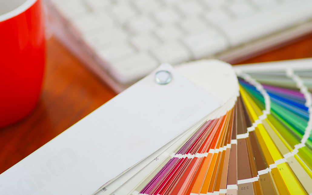
Choosing the Best Color Palette for Your Website
Choosing the right color scheme is essential to your website’s success. Stephen Moyers (speckyboy.com) analyzes 7 website color palettes. Stephen Moyers is an online marketer, designer, avid tech-savvy blogger. He loves to write about web design, development, online marketing, social media and much more. Speckyboy is an online magazine for designers with its focus on sharing helpful resources, exploring new techniques, sharing useful tips, and inspiring you to build a better web. Image courtesy of pxhidalgo via Bigstockphoto.
Choosing the right color palette in website design is important. However, many people think of it only as an aesthetic choice. In reality, different colors evoke varying emotions in viewers while changing their perception of the company in question. It is essential to portray your company in the correct light with the best colors.
The first recorded color wheel was developed in 1666 by Sir Isaac Newton. Though these circular color diagrams have changed slightly over the years and some debate their exact layout, their key elements have remained consistent.

The primary colors – blue, yellow, and red – are arranged around the wheel. Secondary colors, which are green, orange, and purple, fit between the primary sections. Purple sits between red and blue, since those are the two colors required to make purple. Green and orange follow suit in their placement. Tertiary colors are added in the same way – by combining adjacent colors and then displaying the result between them.
Colors on opposite sides of the wheel from one another are complementary. The maximum contrast these combinations create can bring out the best in each color when properly applied. Examples are green plants with purple flowers, or blue shirts with yellow trim.
Color theory is a field that some have devoted their lives to studying, and there is a great deal of science behind color matching and combining. However, from web designers to hospitals, kindergarten teachers to news outlets, different colors have varying emotional and psychological effects on viewers. How do you best leverage this in website design?
Bright Red, Black, and White
In nature, red is frequently a sign of danger – think of strawberry poison dart frogs or an Anthurium plant. Humans have evolved to see red as a stimulating color that immediately captures attention. News sites frequently employ this color to convey a sense of urgency. Red can even increase blood pressure in patients. As a result, one must apply it wisely – too much red can incite a sense of anger or overstimulation.
Try combining reds with black and white. These blanket colors continue to promote the empowering feeling of red fonts and menu bars while providing a clean backdrop to balance it. Use this combination in designs that convey power and importance:

Medium Orange, Muted Teal, and Beige
Orange conveys a friendly, energizing, and cheerful sense. It is the most sacred of all colors in Hinduism, in which it represents purity. As it pertains to design, this color is highly versatile. Deeper orange can evoke a sense of flame, while at the other side of the spectrum a light orange is cartoonish.
As the primary color in a design, orange is energizing and fun. Though it works equally well as an unobtrusive background color, many embrace the bold and bright look of placing orange forward in websites. This is especially appropriate for younger audiences and websites that do not take themselves too seriously. Try a medium orange with muted teal and beige:

Vibrant Yellow, Black, and Grey
Yellow is a joyous color that inspires enthusiasm in its brighter shades. However, it can connote a sense of antiquity and respect. In ancient cultures, yellow was a color of gods and kings because of their spiritual relationship with the sun. In more-recent history, pale yellows featured prominently in Victorian design, specifically in affluent areas.
For a sophisticated, bright look, vibrant yellows paired with grey and black are excellent choices. Black and grey are traditionally professional colors that have a businesslike feel. Adding yellow creates warmth without detracting from the sophistication:

Bold Green, Beige, and White
Green is a perfect combination of cool blue and warm yellow. It maintains the calming and energizing effects of both colors, creating a sense of balance. Heavily rooted in the earth, green tones are comfortable and convey a sense of safety. Freshness, vitality, and wealth are all associated with the color green. It also represents the heart chakra, and is a symbol of balance and nature.
Using green as the central color in a design, allow the earth tones to carry through without being overbearing. Try using light beige and ivory tones to complement a bold green. The safety and balance of the color translates to the audience in this combination, without painting a clearly tree-inspired look:

Royal Blue, Pale Yellow, Grey
To promote a sense of strength and stability without somberness, try a deep royal blue with pops of a pale yellow and grey. Dark blue is associated with the ocean, giving it a sense of vastness. Royal blues also evoke a feeling of trust, intelligence, and authority. However, blue has also evolved to represent sadness.
Pairing a royal blue with light yellow creates a perfect balance. These two colors sit opposite one another on the color wheel, making them complementary and causing them to highlight one another. Pale yellow brightens the overall look, maintaining the dignity of the royal blue, while keeping it from tipping into a sad color choice:

Lavender, Bright Pink, and Ivory
The color lavender calms the mind and nerves while having an uplifting effect on the viewer. People frequently use lavender plants to help them relax and sleep better. This pale purple shade is a lovely backdrop for elegant designs. However, sticking strictly to lavender can have an overly sleepy impact on the viewer.
Combine lavender with bright pops of pink to keep the eye entertained. Using these tones over a neutral such as ivory allows them to shine without being overwhelming:

Magenta and Dark Grey
Wisdom, intellect, and knowledge are all associated with the color grey. This classic color is sleek and dignified, representing a quiet authority. Resting between the extremes of black and white, it is highly balanced. Magenta is fun, exciting, and stimulating. Similar to red, it has been linked to increased heart rate and blood pressure.
Magenta is a passionate and bold color, with a real sense of joy about it. Combining these two very different colors creates a beautiful look. The pairing of bright and bold with refined and calm creates interest while conveying authority:

Creating Your Palette
The above suggestions are just a few examples of great color palettes to use when creating your website. It is somewhat common for designers to repeatedly fall into the same habits with their color choices. Remember that personal preference must take a back seat to the company’s brand identity.
Begin by writing down some words that describe your brand – sophisticated, fun, intelligent, or whimsical could be examples. Next, consider what colors will convey that sense to your target audience. Factor in the emotions you hope the site will convey as well as what you hope the site will inspire users to do. As an example, a bakery should not use black and white designs – this will not inspire people to eat.
Once you have a target feeling and primary colors for the design, do not be afraid to experiment. Sometimes colors that you assume will clash actually complement one another. Similarly, tones that are too alike may create monotony. Enjoy the design process and further your brand identity.
You might also like to learn about what your eCommerce store colors says about you.